Playbook · Design workflow
How to Design a Logo: A Practical Process From Brief to Vector Files

To design a logo, write a short brief, research the market, sketch many ideas on paper, redraw the best one as a vector, test it at small and large sizes, check that nobody else uses a similar mark, and export a set of files. The work is mostly thinking and editing, not software. This playbook walks through each step in order, shows where logo makers and AI generators help, and lists the files a finished logo needs.
Key takeaways
- A one-page brief written before any drawing prevents most rounds of rework.
- Sketch on paper first: ideas are cheap there, and the best ones survive being redrawn as vectors.
- Build the final logo as vector artwork so it scales from a favicon to a billboard.
- Test every candidate in black and white, at tiny sizes and on busy backgrounds before you pick one.
- Search existing trademarks before you commit, and deliver a full file set, not a single PNG.
What should you decide before you start drawing?
Start with a brief of one page. It should answer who the business serves, what it sells, what it wants to be known for, where the logo will appear and what the logo must never look like. Without these answers, a logo becomes a matter of taste, and taste arguments do not end.
Fix the practical constraints at the same point: the brand name as it is spelled, any tagline that has to sit with it, the places the logo must work (website header, social profile picture, packaging, invoices, a stamp) and any colors that are already in use. If you design for a client, get the brief approved in writing before the first sketch.
Keep the brief short on purpose. A brief that runs to many pages is rarely read again, while one page can be pinned next to the screen and checked against every design decision. When two options both look fine, return to the brief and ask which one serves the audience and the three adjectives better.
- Business in one sentence, and the audience in one sentence.
- Three adjectives for the personality (for example calm, precise, warm), and three it must not be.
- Three to five competitors or neighbors whose logos you will study.
- Where the logo is used, and the smallest size it must work at.
- Existing colors, fonts or symbols that must stay.
- Deadline, budget and who signs off.
How do you research the market and the name?
Collect the logos of competitors and adjacent businesses into one board and look for patterns: common colors, symbol types and letter styles. The aim is not to copy them. It is to find what everyone does so you can choose to match it where recognition helps and to differ where it does not.
Research the name as well. A name that is hard to spell or long to set in a wordmark changes the whole design. A long name suggests a wordmark with a compact symbol alongside, while a short name works well as a stand-alone lettermark.
Say the name aloud and write it in lowercase, uppercase and title case. Some names look balanced in lowercase and clumsy in capitals, and a logo must work in the form people will actually see most. Note any letter combinations that join awkwardly, such as tall letters side by side, since these affect kerning and the overall shape.
Which type of logo suits the business?
Most logos fall into a few types, and choosing one early narrows the sketching. A wordmark sets the name in custom or carefully chosen type. A lettermark uses initials.
A symbol (or pictorial mark) is an icon that stands for the brand. A combination mark pairs a symbol and a wordmark, which is the safest option for a new brand because the name is visible while the symbol is still unknown.
Whatever type you pick, aim for a shape that is simple enough to be drawn from memory. Detail that looks refined on a large screen turns into noise at small sizes, which is where most logos spend their time.
How do you sketch logo ideas that go somewhere?
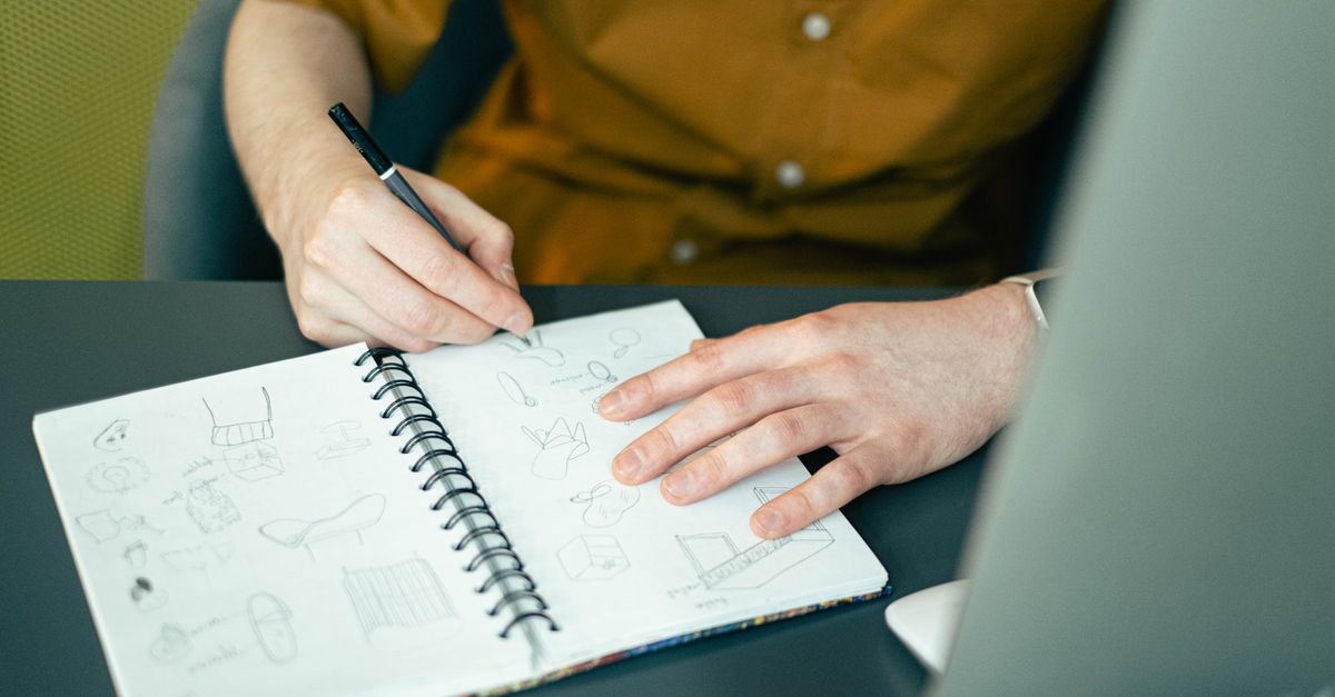
Sketch on paper or a tablet with a thick pen, fast and small. Fill a page with thumbnails rather than perfecting one drawing. Thick lines force simple shapes, and you can see within seconds whether a form is distinct or generic.
Work in rounds. In round one, produce as many different concepts as you can without judging them. In round two, pick three to five and push each into several variations: change the proportions, simplify the shape, try negative space.
In round three, put the survivors next to each other in grayscale and remove the weakest until two or three remain.
- Draw at thumbnail size so you cannot add detail.
- Use only black ink in the first round to keep color out of the decision.
- Turn the page upside down and squint: a good mark stays recognizable.
- Ask someone outside the project what they see and note the first word they say.
- Keep a note of why each concept was dropped, so the client's questions have answers.
How do you turn a sketch into a vector logo?
Rebuild the chosen sketch in a vector editor. Place the scan as a locked background layer and draw over it with basic shapes (circles, rectangles, rounded rectangles) and the pen tool, using as few anchor points as possible. Fewer points mean smoother curves and a file that is easier to edit later.
Our vector graphics software category lists editors for this step, and graphic design software covers broader suites.
Use geometry to hold the design together: align shapes to a grid, use consistent corner radii and stroke widths, and compare the optical balance by eye, since mathematically centered shapes often look off-center. If you are not sure why vector is the right format, read vector vs raster images.
If you only have a rough raster sketch or a scan of an old logo, tracing is another route. How to convert an image to vector describes the tools and the cleanup that automatic tracing needs, and our image to vector converters list compares them.
Save versions as you go (logo-v1, logo-v2) instead of overwriting, and keep the construction layers visible in a working copy. When a client asks why a curve sits where it does, you can show the grid and the underlying circles. Before you move on, expand strokes into filled shapes in the master only if you are sure the logo will not need stroke-width changes, and keep a copy with strokes live.
How do you choose type and color?
Choose one typeface for the wordmark and test two or three. Check that letters do not collide at small sizes, that similar characters stay distinct and that the weight holds up in reverse (light text on a dark background). Check the license of the font before you build a logo on it, because some free fonts allow personal use only.
Convert the final text to outlines in the master file, and keep an editable version.
Start the logo in black on white. A mark that works only because of its color is fragile. Add color afterwards, and define a primary palette of one or two colors, with exact values in HEX, RGB and CMYK or Pantone if the logo will be printed.
Check contrast between the logo and each background where it will sit.
Resist adding a gradient or effect to rescue a weak shape. Effects hide problems on a screen and fail in print, embroidery, engraving and one-color stamps. If the flat version works, an effect can be added later as a variation, but it should never be the version the identity depends on.
How do you test a logo before you approve it?
Test in the places where the logo will really appear. Place it into a mockup of the website header, a social profile circle, an app icon square, an invoice and a printed item. Our mockup generators category lists tools that speed this up.
Then stress it: shrink it to favicon size, show it in one color, place it on a photo and on a dark background, and view it blurred. A strong logo survives all of these without a redesign.
Show the shortlist to a few people who match the audience, and ask what the logo suggests rather than whether they like it. Written feedback about meaning is more useful than taste, because it tells you whether the mark says what the brief asked for. Collect the answers in one place and change only what several people mention.
- Small: still readable at about the size of a browser tab icon.
- One color: works in pure black and pure white.
- Reversed: has a version for dark backgrounds.
- Busy background: remains legible over a photo or pattern.
- Distinct: not confused with the three competitors you collected.
- Square and wide: fits both a round avatar and a horizontal header.
Do you need to check trademarks before you use a logo?
Yes, run a search before you commit to a design. The USPTO defines a trademark as any word, phrase, symbol, design or combination of these that identifies your goods or services, and logos fall under that definition. In the United States you become an owner of the mark when you start using it, but unregistered rights are limited to the geographic area where you operate, while registration creates stronger, nationwide rights.
The USPTO trademark search system lets you look for similar marks, and the agency points searchers to design search codes for figurative elements and to the Trademark ID Manual for matching goods and services. A search does not guarantee that a logo is free to use. For a business that depends on its brand, consult a trademark attorney in the countries where it will trade, since rules differ by country.
Use the TM symbol for goods or SM for services at any time. The registered symbol is only for marks that are actually registered, and only with the goods or services listed in the registration. Never base a logo on another company's mark, and do not use a brand's official logo as the starting point for your own.
Should you use a logo maker or an AI generator?
Logo makers and AI generators are a reasonable start for a side project, a test brand or a placeholder. They are fast and cheap, but several businesses can end up with similar results, because the tools draw from the same templates and styles. Check the license terms for commercial use and for exclusivity before relying on the output, and run the same trademark search as for any other logo.
Compare options in our logo makers and AI logo generators categories. If you use a generator, treat its result as a sketch: redraw it as clean vector artwork, simplify it and test it with the checklist above. Our license explainer helps you read the terms.
Which files should you deliver with a finished logo?
A finished logo is a set of files, not a single image. The master is a vector file, and everything else is exported from it. Name files clearly and keep one folder with a short usage note: minimum size, clear space and what not to do, such as stretching or recoloring.
For the differences between formats, see SVG vs EPS vs AI vs PDF.
- Master vector file in the editor's native format, with live text kept in a separate layer.
- SVG for websites and apps, in full color, black, white and reversed versions.
- PDF or EPS vector files for printers.
- PNG exports with transparent backgrounds at several sizes, including a square avatar version.
- A favicon and app icon version if the logo is used there.
- A one-page brand sheet with colors, font names and clear space rules.
If a client or colleague later needs the logo in vector form and only has an image, how to get a logo in vector format explains the legal ways to do it.
Frequently asked questions
How long does it take to design a logo?
A focused project usually takes from a few days to a few weeks, depending on how many revision rounds the brief allows. Research, sketching and testing take longer than drawing the final vector. A logo maker can produce a draft in minutes, but a considered identity needs time for concept work and approval.
What software do I need to design a logo?
You need a vector editor, such as Illustrator, Affinity Designer, Inkscape or Figma, plus paper or a tablet for sketching. Vector artwork scales without losing quality, which a logo needs. Our vector graphics software category compares editors by price and features.
Can I design my own logo for a business?
Yes. You can design it yourself with a vector editor or a logo maker. The risks are a generic result and accidental similarity to another mark, so follow a process, test the logo at small sizes and search existing trademarks.
Hire a designer if the brand is central to the business.
What file format should a logo be in?
Keep a master in vector form, and export SVG for the web, PDF or EPS for print and PNG with a transparent background where vector is not supported. Delivering only a PNG or JPG limits future use, because raster files lose quality when enlarged.
Do I own the copyright to a logo made by a logo maker?
It depends on the tool's terms. Some grant commercial use of the output, some limit it or keep rights in template elements, and AI generated artwork raises separate questions. Read the license before you pay, and keep a copy of the terms at the time of purchase.
How do I check whether my logo is too similar to another one?
Search the trademark database of each country where you will trade. In the United States, the USPTO search system and its design search codes let you look for similar figurative marks. A search lowers the risk but does not remove it, so ask a trademark attorney before a major launch.
Sources and further reading
- What is a trademark?, United States Patent and Trademark Office
- Trademark search, United States Patent and Trademark Office
- Image file type and format guide, MDN Web Docs
- SVG: Getting Started, MDN Web Docs